
Cooper updates its brand identity
Cooper Tires (part of Goodyear) has introduced a new brand identity designed to increase brand recognition and strengthen its position in an increasingly competitive global tire market. The new visual brand system includes updated trademarks and a color palette, while the "modern design language" is intended to help Cooper stand out from competitors, including in the digital environment.
As part of the identity update, the company decided to return to symbols that played an important role in Cooper's history, such as the knight's helmet, which was originally made the brand's logo after the company achieved great success in the market with the Armored Cord tire in the 1940s. The image of a knight will also be used, accompanied by an American gray wolf, which was chosen because it once inhabited the state of Ohio, where Cooper Tire was created.
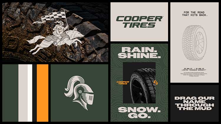
In Cooper's symbolism, the knight will be depicted riding a predator, and the company says that "fierce, quick to adapt, and always ready to overcome any obstacles, the wolf embodies the spirit of Cooper consumers and the capabilities of our products".
The new brand color is the green Valor Green, which is intended to evoke the fact that the company "has been developing tires for challenging conditions for many years, as well as the natural landscapes in which they are used". In addition, an orange color will be used, which was used at the beginning of the brand's history and "symbolizes energy and a unique character".
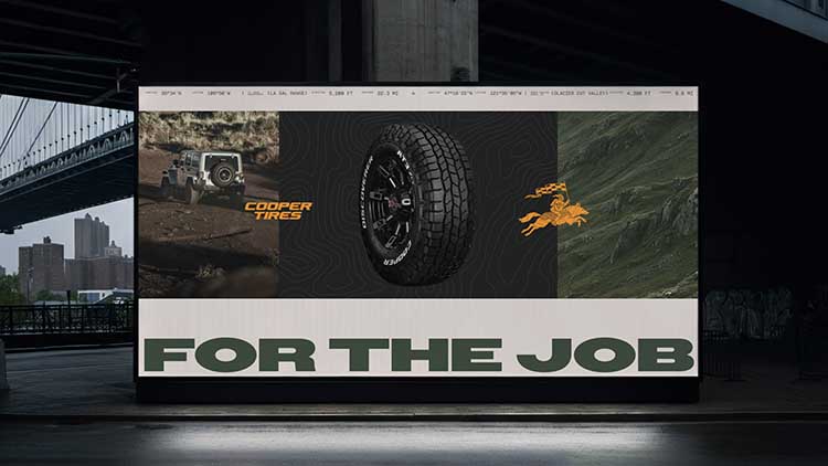
"Over its more than 100-year history, Cooper has won the trust of drivers who are truly demanding of their tires, just like themselves," says Goodyear. "The brand's legacy is reflected in the new identity, which combines Cooper's DNA with modern aesthetics. The result is a brand image that symbolizes strength, determination, and confidence".
The new identity will be used starting from March 2026.